HealthGuru
Problem Statement
Users needs a way to track their health and well-being because they is not meeting their current health goals. We will know this to be true when we see that they can view their medical and other health-related information in one place.
Possible Solution
An app that allows health-conscious individuals to access and track their health information through an online portal. Or an app that helps health-conscious individuals access both physical and mental health promotion content.
The Project
Design a health and wellness app as part of CareerFoundry’s UX Design course
The Role
– UX Researcher
– UX Designer
– UI Designer
Project Brief
Health-conscious users access a responsive portal to log health data and utilize physical and mental wellbeing features.
SWOT Analysis
ZocDoc
HealthTap
Strength
The app provides users the ability to choose new providers within their insurance network and the ability to track these appointments in an organized and easy-to-use format
The app provides a convenient and straightforward way for patients to access their health information online. Users can track their appointment and their health goals while also having access to expert advice from doctors.
Weakness
The app only focuses on doctor visits and does not include any other aspects of the user’s health (ie. wellness or fitness)
Insurance excludes “prime” plan. Tracking is not flexible with set goals; deviating activities, like biking instead of walking, aren’t recognized.
Opportunity
My product will give users the chance to track appointments and also engage with other parts of their health journey including their fitness and mental wellbeing.
In my own design I could look at ways to improve the flexibility of these goals.
Threat
Both Amino Health and Better Doctor offer on-demand booking for patients looking to find healthcare providers.
Spruce Health advertises itself as the ‘all in one healthcare communication’ app allowing users fast and easy communication with their providers by secure messaging, phone, video, and more.
The Goal
Offer a competitive application that allows patients to track all of their health and wellness related information. There are few applications that provide all of the users health info at a glance and so our biggest challenge is usability. we must deliver an intuitive, well organized product that allows users to track their information. Marketing will be important as it shows our users the convenience of the features that we offer.
Getting to Know the User
For my initial user interviews I wanted to explore the landscape of health apps and understand what users valued in them. I set out to investigate several key aspects: how people integrated health apps into their lives, the pain points they encountered with existing solutions, and the specific features they found appealing. To delve into these aspects, I formulated a set of questions and gathered initial data from potential users of the HealthGuru app. I then took part in an affinity mapping exercise that allowed me to identify common themes, questions, and comments. Through this analysis, I gained valuable insights into the recurring patterns and behaviors of patients in their interactions related to health.

User Personas
This data laid the foundation for creating two distinct user personas, serving as valuable references as the project evolved.


User Flows & Site Mapping
I then, began crafting user flows for various features I envisioned within the app. One such feature was the Health Calendar, which I aimed to incorporate. This calendar would empower users to schedule and manage health-related events, such as doctor appointments or dental check-ups.
Create a health event
- Open the app and sign in
- Navigate to the health calendar
- Create a new “health event”
- Save appointment
- View the appointment on the health calendar


Download directions to the gym
- Download the app
- Make an account
- Search for nearby gyms
- Filter gyms by distance
- Download directions to the gym
- Jog to the gym
As I progressed, I expanded my perspective to encompass the overall app structure, ensuring seamless navigation between pages.

Low Fidelity Wireframes for Two HealthGuru Features

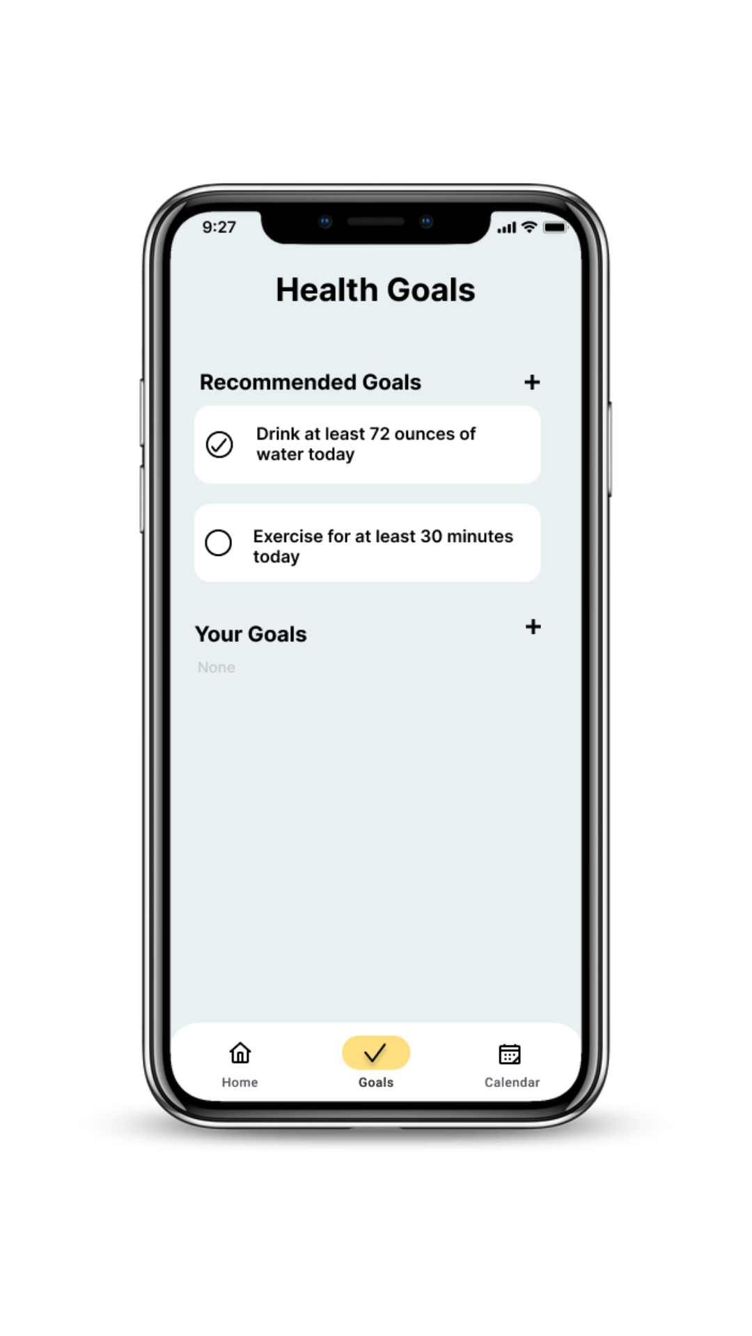
Add a health goal
These three slides outline the process of setting a health goal. The initial slide serves as the home page, followed by the second slide where users input specific details about the goal, including the deadline. The third page displays the Health Goals section, featuring a comprehensive list of all currently active health goals.
Add a health event
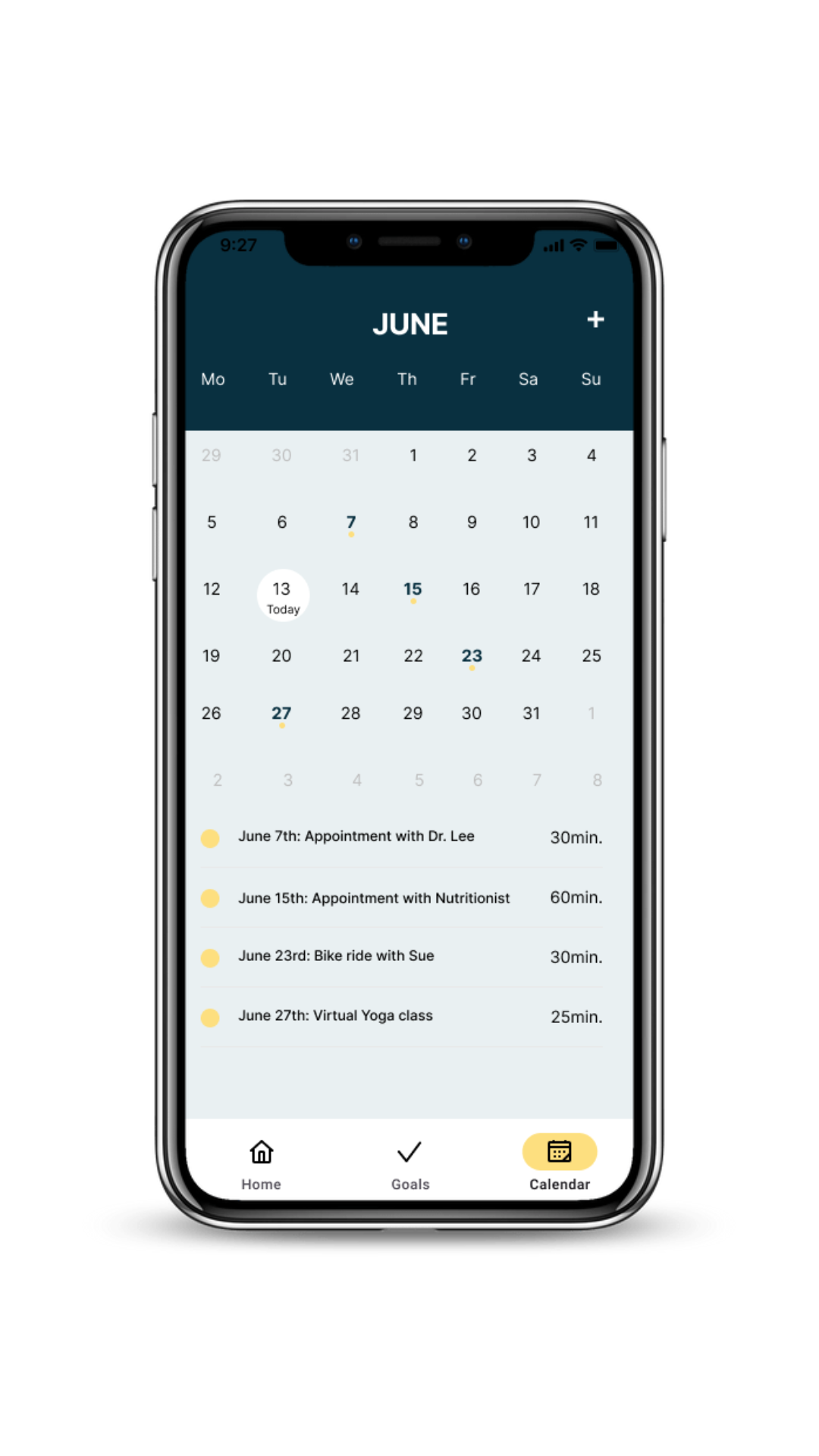
This set of slides illustrates the process of adding a health event to the health calendar. It commences on the home page, where users can click on the calendar icon in the bottom navigation bar to access the calendar home. Next, users can click on the plus button in the top right corner (second image from the left) and fill in the appropriate details (third image from left) to add an event. The fourth page displays an error message that may appear if the user attempts to navigate away before saving the health event.

Key Stages of Change

The design process involved multiple iterations, showcasing significant advancements in recent months. Although the initial designs played a crucial role in laying the project’s foundation, they often lacked intuitiveness and occasionally diverged from user expectations, which was highlighted in the usability tests that I conducted between each iteration of the project.
Usability Testing
I conducted several rounds of usability tests to gather feedback from potential users, as user-centric design is a top priority in this project. Below, are a few of the comments I addressed.

Sign in Page
Comments:
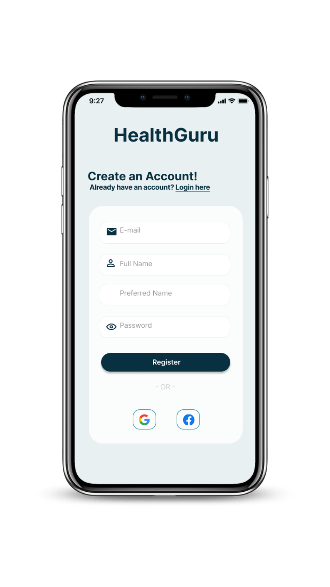
“Social media buttons are a bit cut off on sign-in pages”
“More contrast is needed for grey text on login pages”
How I addressed this:
The social media buttons are an easy fix- just resized
The grey text being too subtle came up twice so it’s best to adjust as users may likely experience the same
Home Page
Comment:
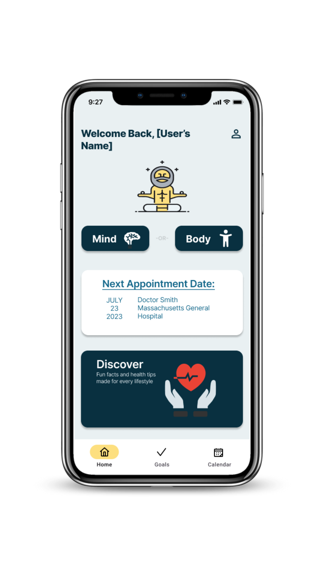
“A lot of blank space in the Discover box, consider adding some descriptive text to fill the space”
How I addressed this:
I added some descriptive text to the discover box


Health Calendar
Comments:
“The navigation bar does not reflect the page change”
“Yellow is hard to see on the health calendar”
How I addressed this:
The purpose of the navigation bar is to let users know what page they are on so I made sure that it reflected the correct page
The original shade of yellow was too difficult to see so I adjusted the color and made them bold
Discover Page
Comment:
“Spacing on the Discover Home is inconsistent”
“Missing label for the image on Discover Home”
How I addressed this:
Consistency is important for a polished look so I corrected the spacing and added the missing label.

UI Elements

Colors & Typography
In contrast to common health apps that use red for its association with health and blood, I’ve opted for a different approach as a health app designer. I want my users to feel welcomed and at ease when using HealthGuru. Therefore, the chosen different shades of blue, creating a calming and serene atmosphere that promotes a sense of calmness during app engagement. I’ve also chosen a pale yellow as an accent color.
HealthGuru!
During the initial phases of the project, I envisioned HealthGuru as a comprehensive health solution, aiming to tackle the diverse health goals outlined at the project’s inception. Nevertheless, owing to time constraints and valuable insights gathered from usability and preference tests, I progressively refined the design to its present state.
Explore my HealthGuru prototype here!
Next Steps
The design process is continuous, and although my current model addresses parts of the problem I set out to solve, there is unquestionably space for further refinement and enhancement. Additional effort is required to enhance the UI elements of the project, ensuring consistent themes, icons, and images. I am eager to collaborate with a developer to incorporate animations into certain images, enhancing the overall appeal and inviting nature of the app. Furthermore, I aim to broaden the app by incorporating a dedicated section focused on food and diet. Although it was initially part of the original plan, time constraints led me to exclude it from this iteration.